Theming
Theming can be achieved by passing the Theme object to the RecognitionSettings, which is used when instantiating fragments as described on the Getting Started page.
Theme class provides different customization options, like defining app colors and styles of different UI components.
An example of theming is shown in the code sample below.
val settings = RecognitionSettings {
    theme(
        Theme {
            themeColors(
                ThemeColors.Builder()
                .primaryColor(Color.resourceColor(context, R.color.purple))
                .secondaryColor(Color.hexColor(0xFF_7FF_F00))
                .textColor(Color.composeColor(ComposeColor.Yellow))
                .build()
            )
            statusBannerStyle(
                StatusBannerStyle.Builder()
                .noPromotionText(Text.stringRes(R.string.text))
                .build()
            )
            resultDetailsStyle(ResultDetailsStyle.Builder()
                .detailsIcon(Icon.drawableRes(R.drawable.ic_tag))
                .detailsIconTintColor(Color.hexColor(0xFF_000_000))
                .build()
            )
            permissionOverlayStyle(
                PermissionOverlayStyle.Builder()
                .backgroundColor(Color.composeColor(ComposeColor.LightGray))
                .buttonBackgroundColor(Color.hexColor(0xFF_000_000))
                .buttonText(Text.stringRes(R.string.button))
                .buttonTextColor(Color.hexColor(0xFF_FFF_FFF))
                .build()
            )
        }
    )
}
When specifying any color, make sure to use SDK’s Color class.
The class contains helper methods that can create a Color object from resource color, hex value, or Compose Color.
The following sections contain a detailed description of how Theme can be used to customize the experience.
Colors
It is possible to define the following colors as part of the ThemeColors object:
- the primary color, the default value is
#0F62F2 - the secondary color, the default value is
#DFFE00 - the text color, the default value is
#142641
ThemeColors.Builder()
    .primaryColor(Color.resourceColor(context, R.color.purple))
    .secondaryColor(Color.hexColor(0xFF_7FF_F00))
    .textColor(Color.composeColor(ComposeColor.Yellow))
    .build()
Note that defining some of the styles below can override the colors mentioned in this section.
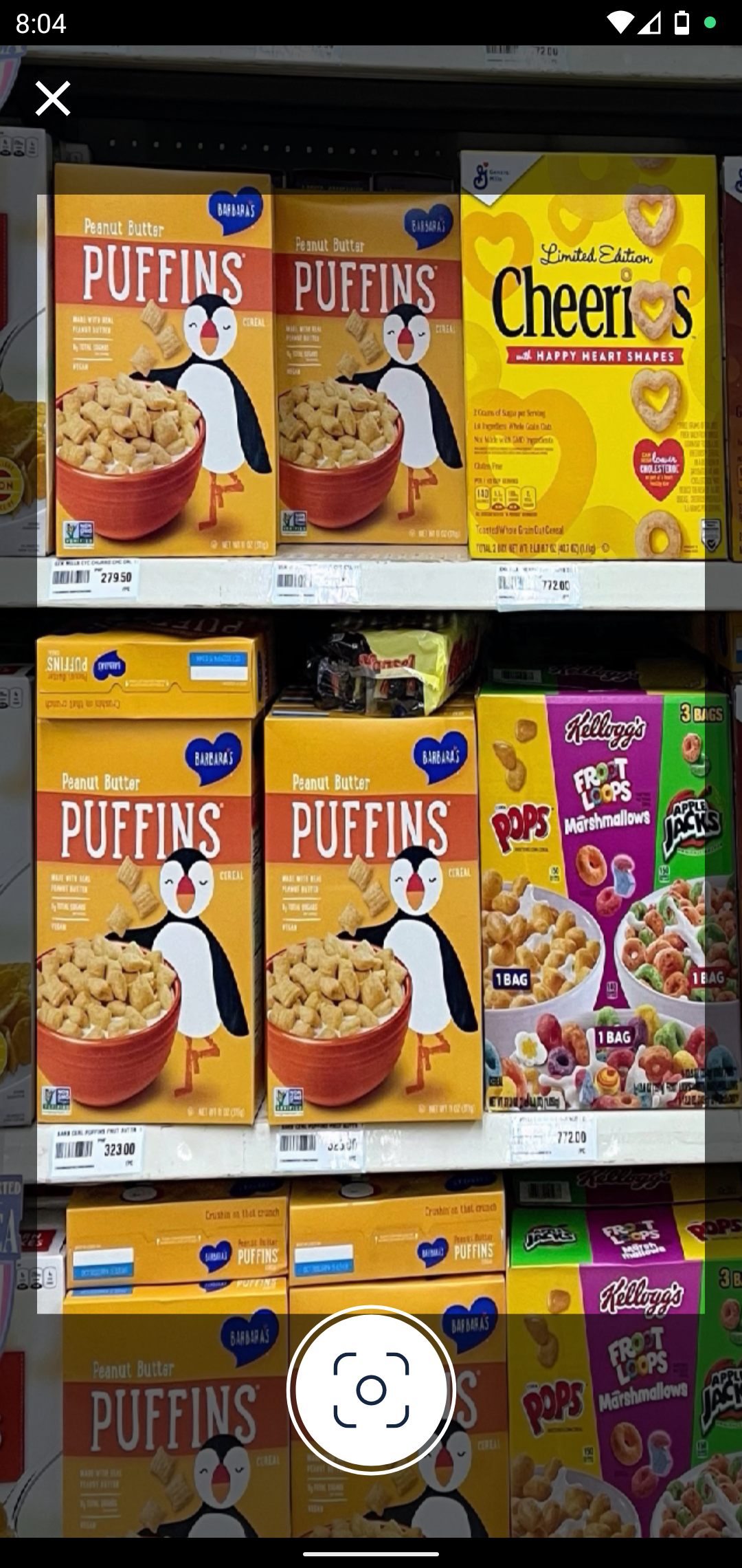
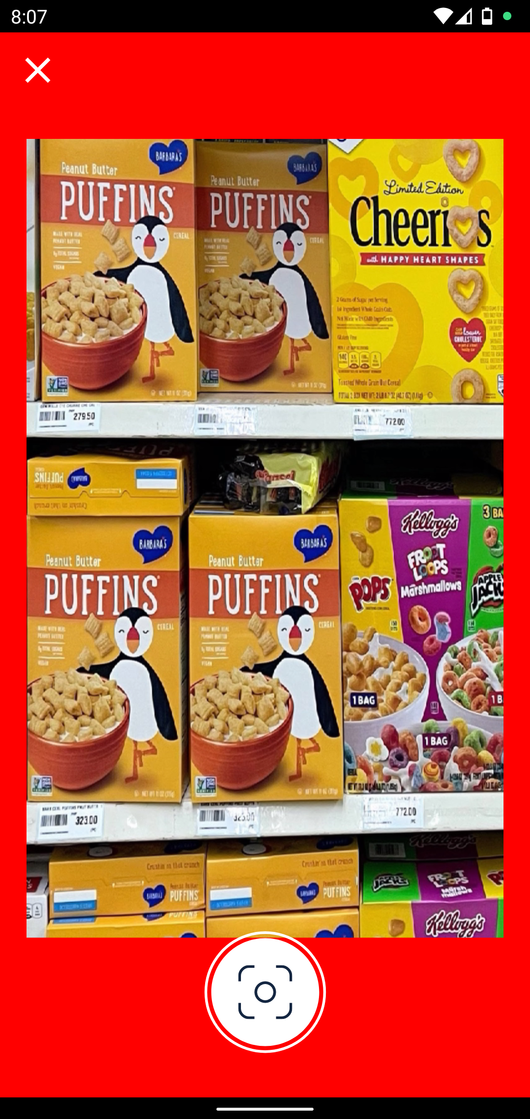
Boundary Style
If a region of interest is defined, boundaries will be applied to the scanning frame.
BoundaryStyle.Builder()
    .color(Color.composeColor(ComposeColor.Red))
    .build()
| Default Boundary | Custom Boundary |
|---|---|
 |
 |
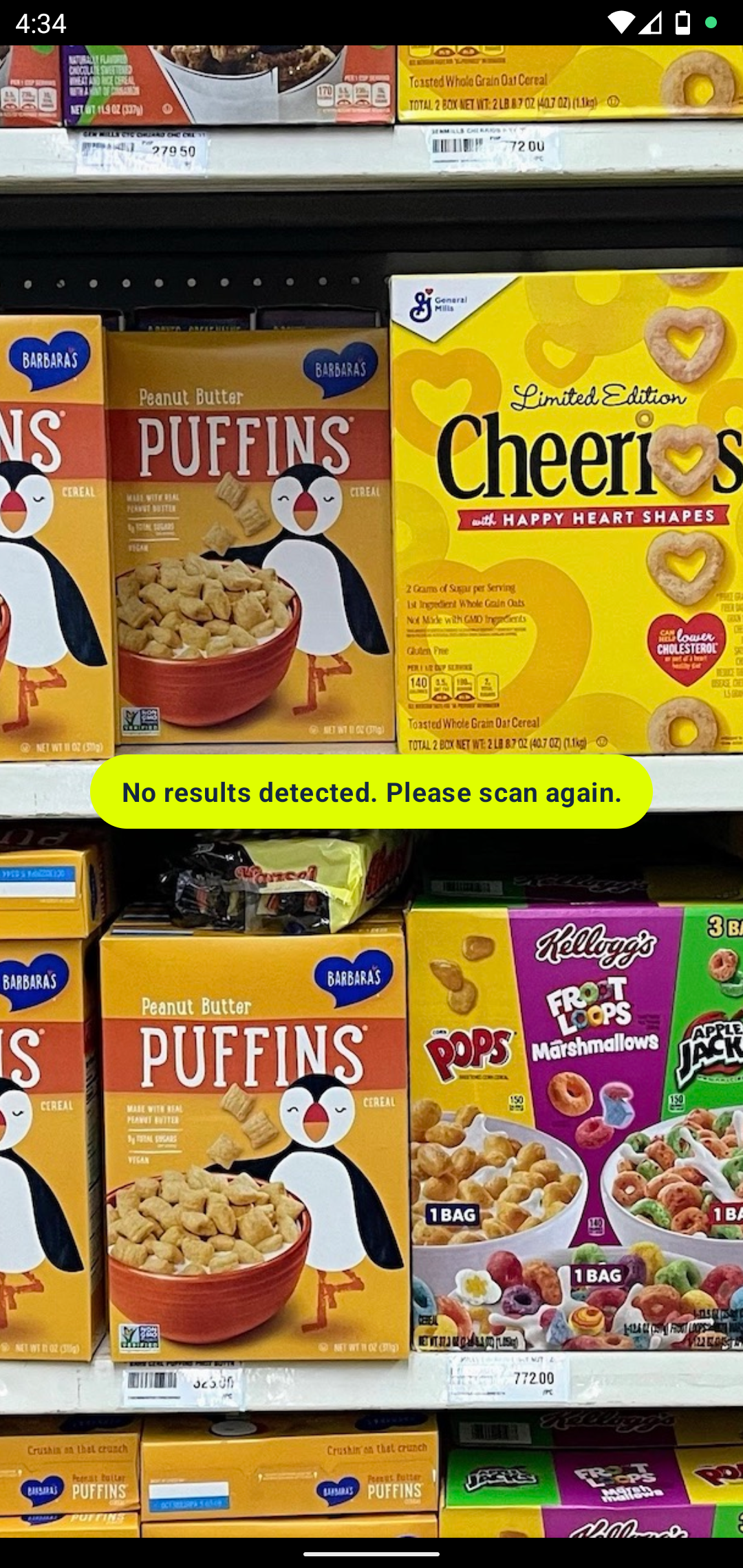
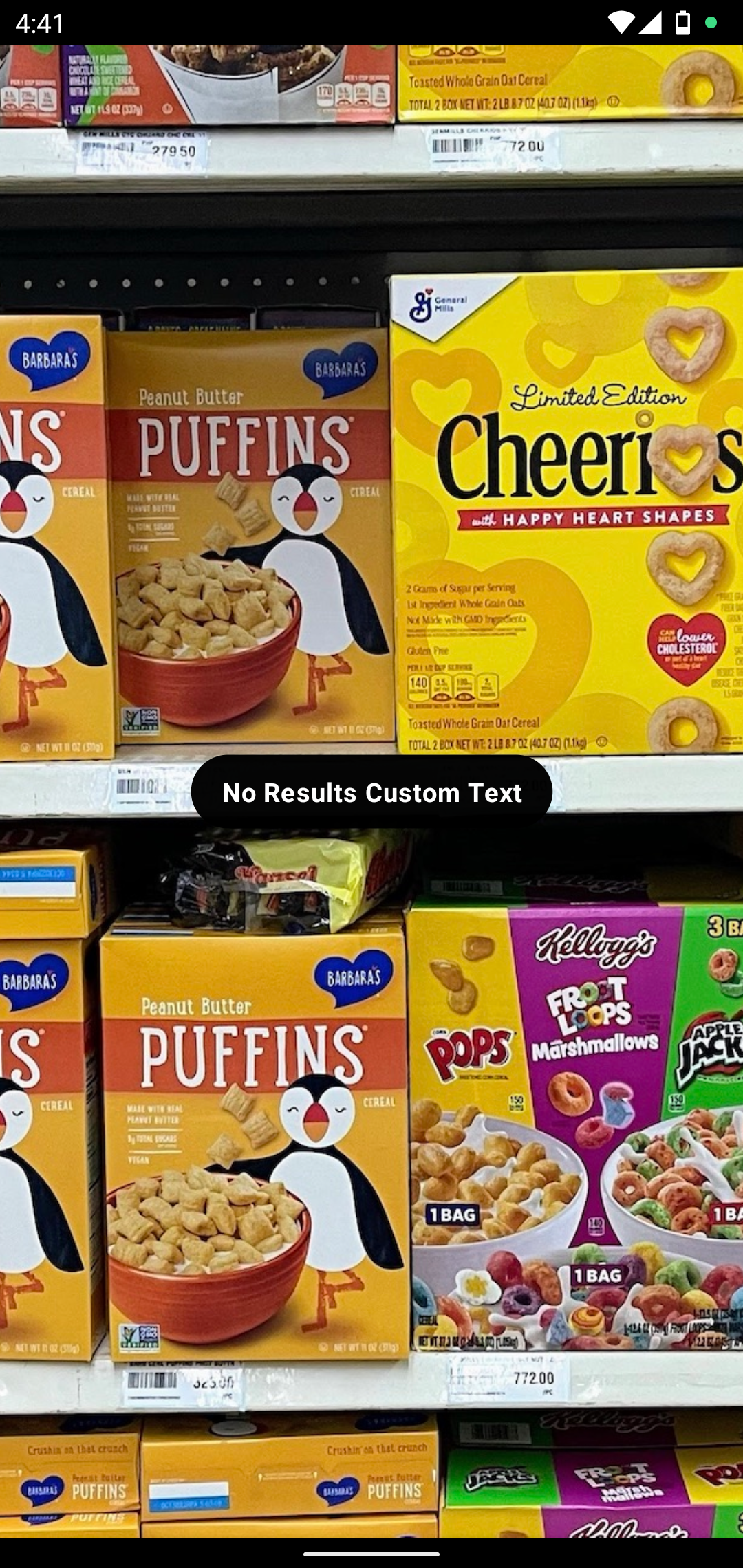
Status Banner Style
Style used to define the look and feel of the status banner that appears for certain errors, like “no results found”.
StatusBannerStyle.Builder()
    .textColor(Color.hexColor(0xFF_FFF_FFF))
    .backgroundColor(Color.hexColor(0xFF_000_000))
    .noPromotionText(Text.stringRes(R.string.text))
    .build()
| Default Status Banner | Custom Status Banner |
|---|---|
 |
 |
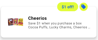
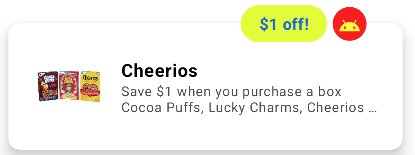
Promotion Banner Style
Style used to define the look and feel of the promotion banner shown on top of the results.
PromotionBannerStyle.Builder()
    .textColor(Color.composeColor(ComposeColor.Yellow))
    .backgroundColor(Color.composeColor(ComposeColor.Red))
    .build()
| Default Promotion Banner | Custom Promotion Banner |
|---|---|
 |
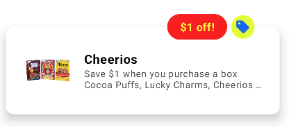 |
 |
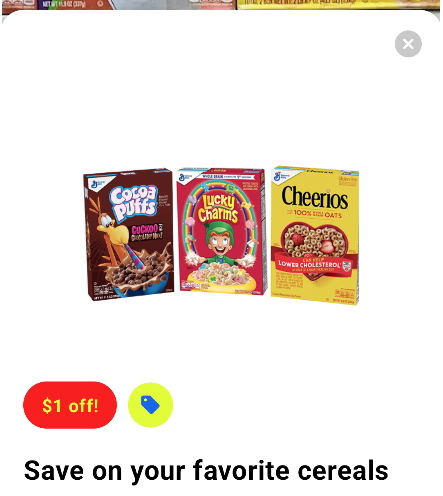 |
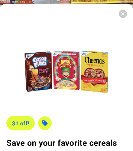
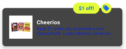
Promotion Tag Style
Style used to define the look of the indicator similar to the banner, containing an icon, shown on top of the results.
PromotionTagStyle.Builder()
    .icon(Icon.drawableRes(R.drawable.ic_tag))
    .tintColor(Color.composeColor(ComposeColor.Yellow))
    .backgroundColor(Color.composeColor(ComposeColor.Red))
    .build()
| Default Promotion Tag | Custom Promotion Tag |
|---|---|
 |
 |
 |
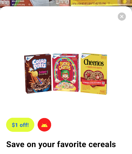 |
Close Button Style
Style used to define the camera’s close button appearance.
CloseButtonStyle.Builder()
    .icon(Icon.drawableRes(R.drawable.ic_close))
    .tintColor(Color.composeColor(ComposeColor.Magenta))
    .build()
| Default Close Button | Custom Close Button |
|---|---|
 |
 |
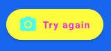
Camera Button Style
Style used to define the camera button appearance.
CameraButtonStyle.Builder()
    .icon(Icon.drawableRes(R.drawable.ic_camera))
    .tintColor(Color.composeColor(ComposeColor.Cyan))
    .build()
| Default Camera Button | Custom Camera Button |
|---|---|
 |
 |
Result Indicator Style
Style used for indicator displayed on top of the detected product.
ResultIndicatorStyle.Builder()
    .backgroundColor(Color.composeColor(ComposeColor.Blue))
    .promotionIcon(Icon.drawableRes(R.drawable.ic_tag))
    .promotionIconTintColor(Color.hexColor(0xFF_FFF_FFF))
    .promotionCounterBackgroundColor(Color.resourceColor(context, R.color.green))
    .promotionCounterTextColor(Color.hexColor(0xFF_000_000))
    .build()
| Default Result Indicator | Custom Result Indicator |
|---|---|
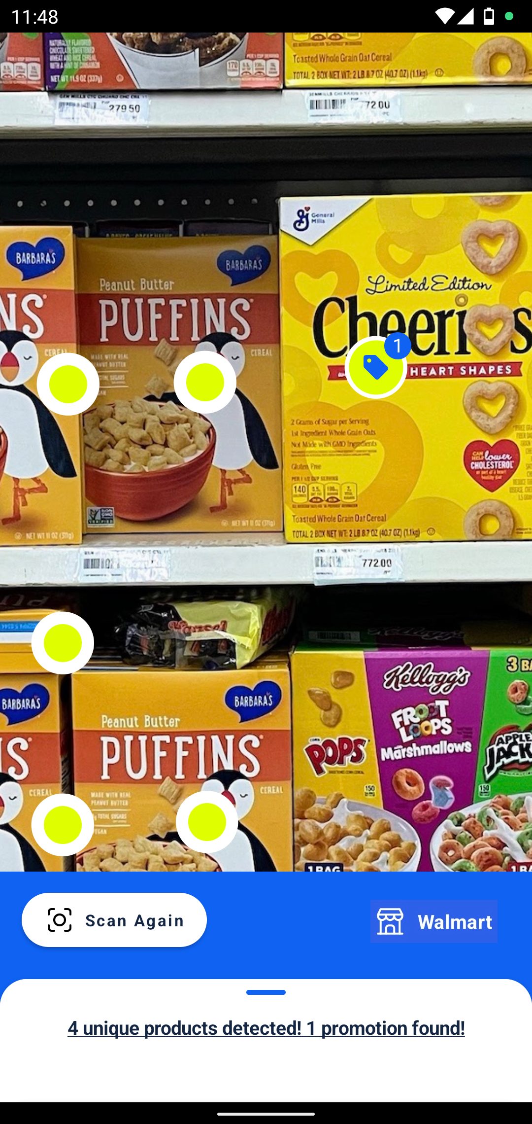 |
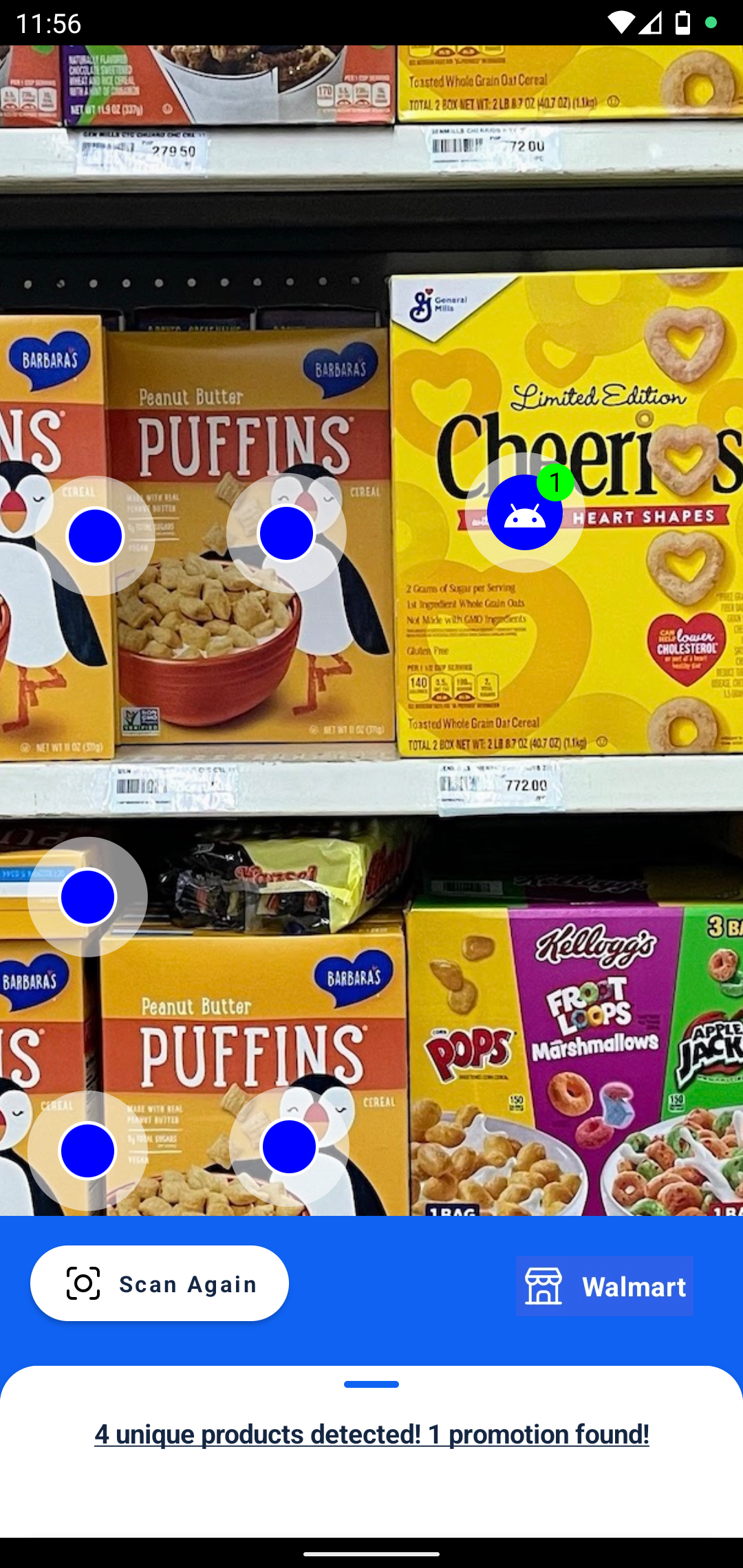 |
Result Card Style
Style used to define the appearance of the card containing results, i.e. product and promotion details.
ResultCardStyle.Builder()
    .titleTextColor(Color.hexColor(0xFF_FFF_FFF))
    .subtitleTextColor(Color.composeColor(ComposeColor.Green))
    .detailsTextColor(Color.composeColor(ComposeColor.Blue))
    .backgroundColor(Color.composeColor(ComposeColor.DarkGray))
    .build()
| Default Result Card | Custom Result Card |
|---|---|
 |
 |
Result Details Style
Style used to define the appearance of the bottom sheet containing result details.
ResultDetailsStyle.Builder()
    .closeIcon(Icon.drawableRes(R.drawable.ic_close))
    .titleTextColor(Color.composeColor(ComposeColor.Yellow))
    .detailsIcon(Icon.drawableRes(R.drawable.ic_tag))
    .detailsIconTintColor(Color.hexColor(0xFF_000_000))
    .detailsLabelTextColor(Color.composeColor(ComposeColor.Red))
    .detailsStrokeColor(Color.hexColor(0xFF_FFF_FFF))
    .detailsTitleTextColor(Color.composeColor(ComposeColor.Blue))
    .detailsContentTextColor(Color.resourceColor(context, R.color.green))
    .backgroundColor(Color.composeColor(ComposeColor.LightGray))
    .build()
| Default Result Details | Custom Result Details |
|---|---|
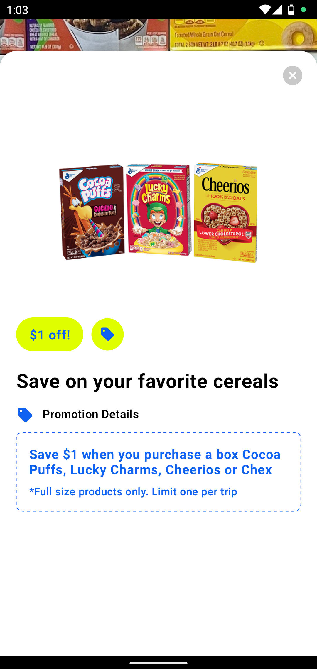 |
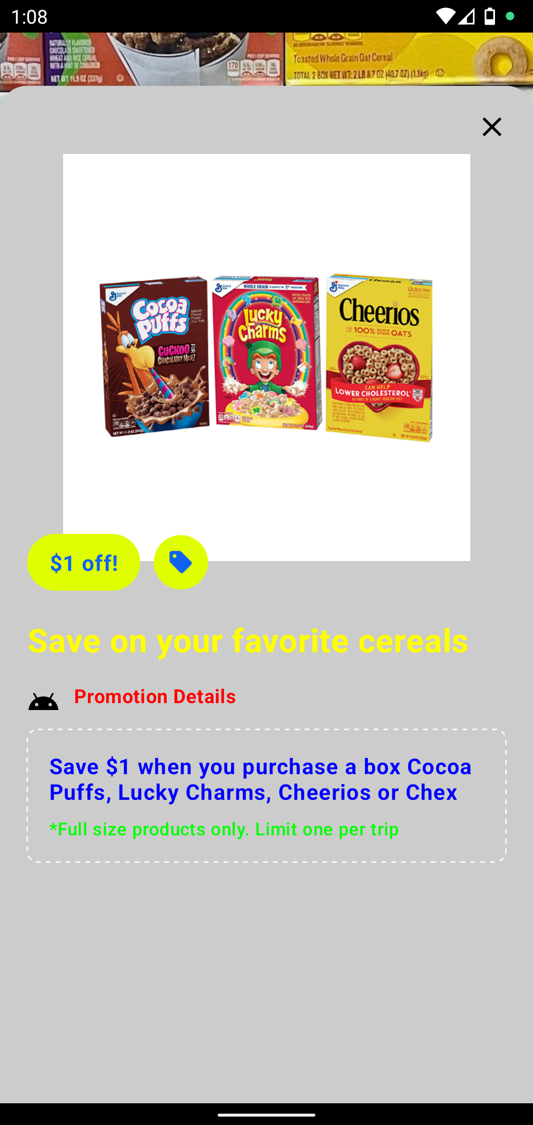 |
Result List Container Style
Style used to define the appearance of the bottom sheet containing results, i.e. list of products and promotions, and the sheet’s container.
ResultListContainerStyle.Builder()
    .containerBackgroundColor(Color.resourceColor(context, R.color.purple))
    .sheetBackgroundColor(Color.composeColor(ComposeColor.Yellow))
    .notchColor(Color.composeColor(ComposeColor.Green))
    .titleTextColor(Color.hexColor(0xFF_000_000))
    .sectionHeaderTextColor(Color.composeColor(ComposeColor.Red))
    .listHeaderTextColor(Color.composeColor(ComposeColor.Cyan))
    .dividerColor(Color.composeColor(ComposeColor.Red))
    .build()
| Default Result List Container | Custom Result List Container |
|---|---|
 |
 |
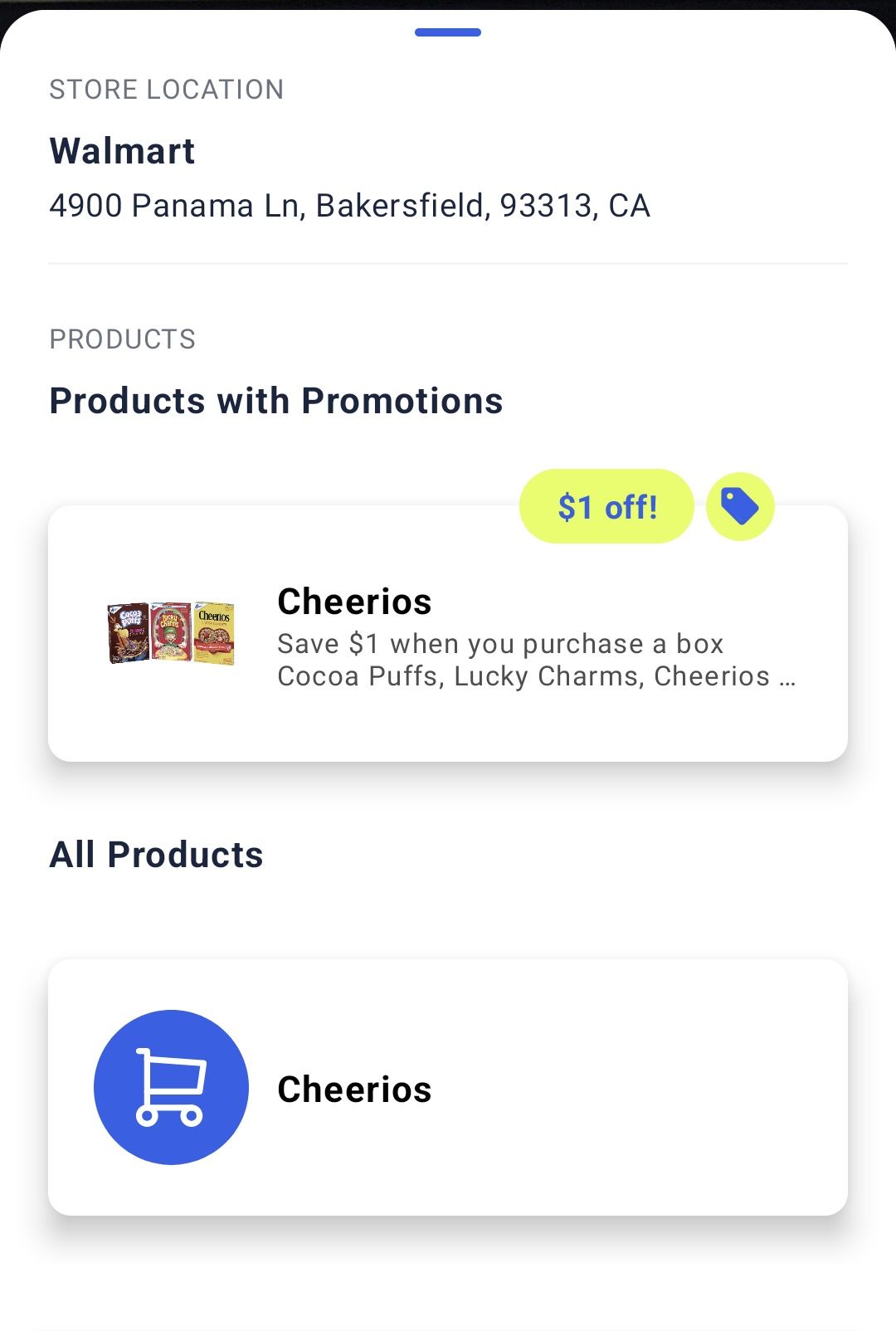 |
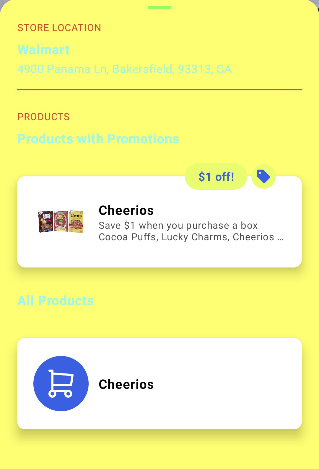 |
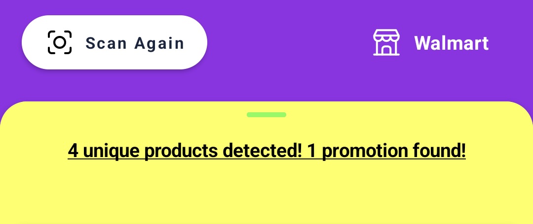
Scan Again Button Style
Style used to define the look of the scan again button that appears at the top of the results container.
ScanAgainButtonStyle.Builder()
    .backgroundColor(Color.composeColor(ComposeColor.Yellow))
    .icon(Icon.drawableRes(R.drawable.ic_cam))
    .iconTintColor(Color.composeColor(ComposeColor.Cyan))
    .text(Text.stringRes(R.string.text))
    .textColor(Color.composeColor(ComposeColor.Magenta))
    .build()
| Default Scan Again Button | Custom Scan Again Button |
|---|---|
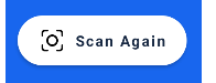 |
 |
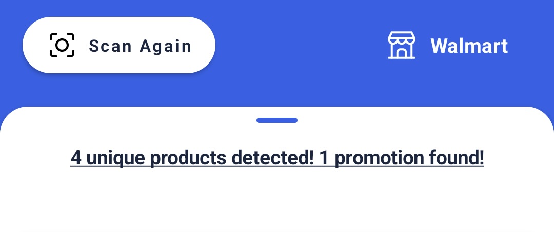
Store Display Style
Style used to define the look of the store info display, positioned at the top of the results container.
StoreDisplayStyle.Builder()
    .icon(Icon.drawableRes(R.drawable.ic_tag))
    .iconTintColor(Color.composeColor(ComposeColor.Yellow))
    .textColor(Color.composeColor(ComposeColor.Magenta))
    .build()
| Default Store Display | Custom Store Display |
|---|---|
 |
 |
Permission Overlay Style
Style used to define the look of the permission overlay.
PermissionOverlayStyle.Builder()
    .backgroundColor(Color.composeColor(ComposeColor.LightGray))
    .detailsText(Text.stringRes(R.string.details))
    .detailsTextColor(Color.composeColor(ComposeColor.Magenta))
    .buttonBackgroundColor(Color.hexColor(0xFF_000_000))
    .buttonText(Text.stringRes(R.string.button))
    .buttonTextColor(Color.hexColor(0xFF_FFF_FFF))
    .build()
| Default Permission Overlay | Custom Permission Overlay |
|---|---|
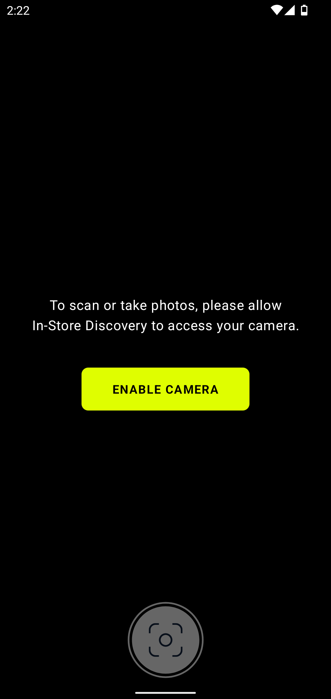 |
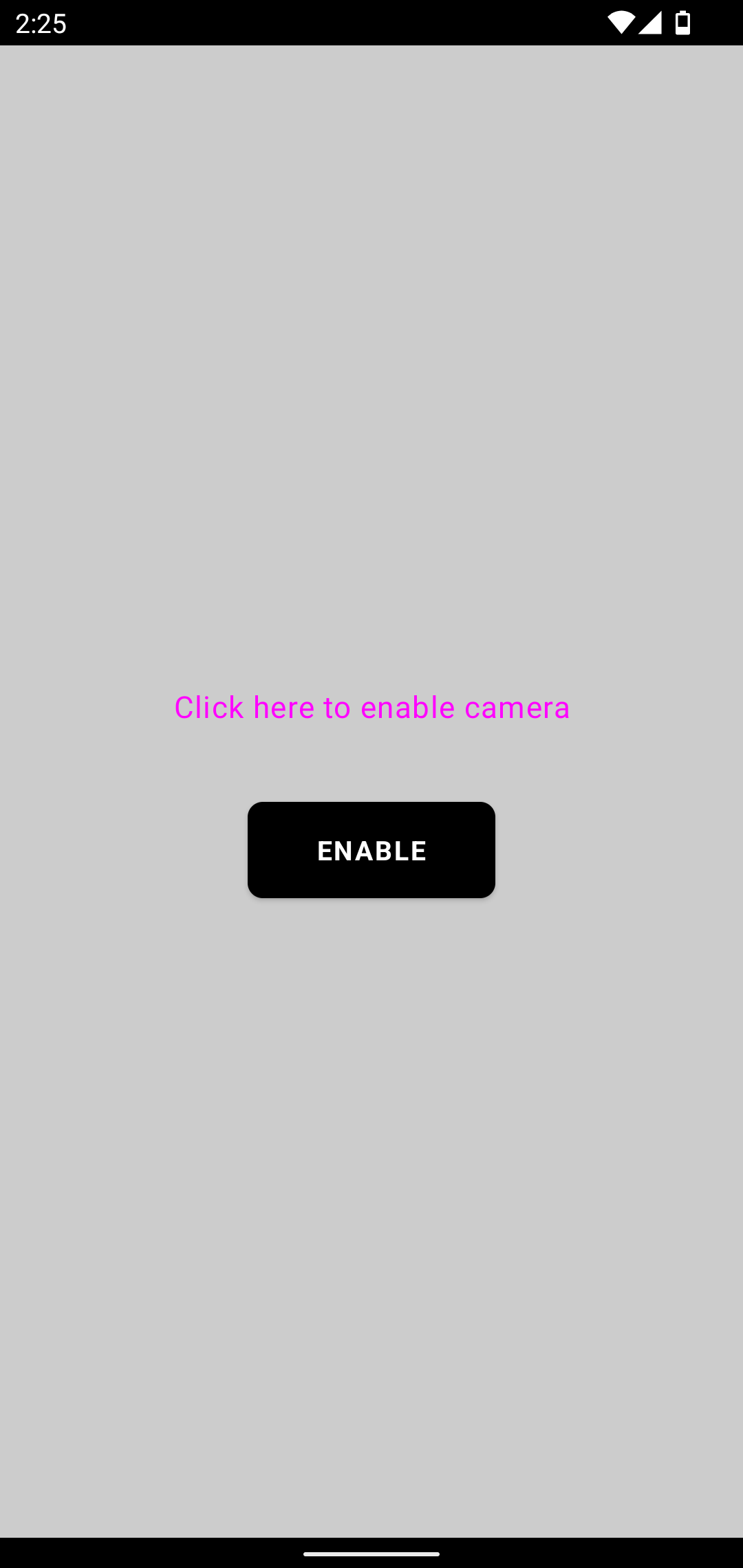 |